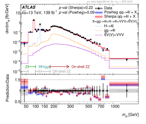
ATLAS measurement, in 13TeV proton-proton collisions, of the differential cross section as a function of the four-lepton mass
I wrote about an earlier version of this measurement here. We have now measured the distribution with the full data set from the highest energy (13TeV) collisions that we have so far. There was also quite a lot of work involved in making the measurement (even) more model-independent, and testing the statistical treatment of the various way in which it can be (re)interpreted.
Here’s the explanation of the plot itself that I wrote back in 2016…
The horizontal axis is the ‘mass’ of the four leptons. This doesn’t mean just adding up their masses, it means calculating the mass of the total four-lepton system. That is the same as hypothesising that they were all produced from the decay of a single particle, and working out what its mass must have been. The unit is GeV – “Giga electronVolt” – which is actually a unit of energy. Since energy is proportional to mass (E = mc2) this is ok. One GeV is a bit more than one proton mass.
The vertical axis indicates how many events were seen. The units are femtobarns, which isn’t really important, but if you want to know what they mean try here.
Now the data, and what that means.
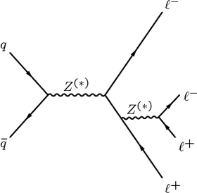
There are several different ways of producing four leptons at the LHC. We calculate the probabilities using the Standard Model of particle physics, and in particular the diagrams invented by the great 20th Century physicist Richard Feynman. All the relevant diagrams have to be included or you don’t get the correct answer. Here is one of them (A).
(A) One of the Feynman diagrams for four-lepton production at the LHC Illustration: ATLAS/CERN
In this diagram, a quark and an anti-quark come in from the left side of the diagram (one from each proton). They scatter and produce two Z bosons. The Z is the carrier of the weak force and has a mass of about 91 GeV. Both Zs decay rapidly to two leptons each, giving us the four leptons required. How does this diagram affect the plot?
Because each Z has a mass of 91 GeV, you might expect this diagram to show up in the plot only when the four-lepton mass is twice this or more – that is 182 GeV and above. And indeed there is a big rise between the fifth and sixth data points from the left, at about 182 GeV. But because quantum mechanics is slippery, the Z bosons don’t have to have exactly 91 GeV of mass. That’s why they have little asterisks on them in the diagram, they are what we call virtual particles. There are contributions all across the plot from this diagram. But there is a big enhancement when the Zs can have the right mass, and that’s the rise at 182 GeV.
There are other features and other diagrams though. Next look at the leftmost bin of the plot, which is pretty high too. This is about 91 GeV, which correctly suggests that the Z might be involved again. The relevant diagram is (B).
(B) Another Feynman diagram for ZZ-to-four-leptons Photograph: ATLAS/CERN
In this diagram, there is a big enhancement in the number of events when the first Z from in the diagram has the ‘correct’ mass of 91 GeV. In that case, the second Z (further to the right) has a much lower mass. In fact that “Z” could quite often be a virtual photon instead of a Z. Effectively all four leptons come from the first Z, and their combined mass will be 91 GeV, reflecting that. If we had the mass plot for events containing only two leptons, there would be a huge peak at 91 GeV. The extra Z we have here is an unlikely ‘higher order correction’ to that process, but because we demanded four leptons, we see it.
The final feature of the plot is probably the most interesting. The third bin from the left is also very high compared to its neighbours. It is at a mass of about 125 GeV, and it comes from digrams like this (C).
(C) Feynman diagram for four-lepton production via a Higgs boson Photograph: ATLAS/CERN
Here, two gluons (the carriers of the strong force) come in, one from each proton. There is a triangular loop, which would mainly have a top quark going around it (not labelled), which produces a Higgs boson. The Higgs then decays to two Zs (at least one of which much have the ‘wrong’ mass, i.e. below 91 GeV). Once more, the Zs decay to two leptons each. There is a peak when the Higgs boson has its correct mass of 125 GeV.
The red lines, with the shaded bands around them, show the theoretical calculation, which is scattered around the measurement a bit but basically tracks the features of the data very nicely once all the right diagrams are included. Leaving any of these contributions out would give the wrong answer.
So in the one plot you have virtual and real particles, the carriers of the weak and electromagnetic forces, higher-order radiative corrections, and the particle (or field) responsible for giving all the other fundamental particles mass. Quite a rich seam of physics. I especially like that fact the measurement is rather simple and assumes nothing about the theory – it just counts events with four leptons and plots their mass – yet leads to a richly-featured distribution which is understood using such a wide range of aspects of the theory.
The fact that we have now measured this with more data, at higher energies, makes it even more powerful, and we will be mining its implications for a rather long time, I think.